Another piece of music which I made using Garage Band. I like this piece of music because of its rhythm. It is not so dark, the beat is quite fast, howerver, it is quite good in showing the mysterious mood.
Thursday, May 17, 2007
Being inspired by the aesthetic of some old fashion movie, I made this flash to illustrate some characteristics of this kind of movie.
This style reminds me to traditional and cultural aesthetic... Old movies appeared to have some grains. Also, the color is all black and white.
I used my own photographs and change them into grayscale. I also add some old grain to improve the effects. The music in my flash is derived from the immortal song " Cat Bui" written by Trinh Cong Son.
(My flash weight is too big , please wait for a minute)
Tuesday, May 15, 2007
music for assignment 3
This is the music i've made for my assignment 3 - making a film title sequence.
My Song
This is the music that I've created using garage band. Is is very interesting when using this software to create music.
Enjoy it ! ;)
Enjoy it ! ;)
Sunday, May 13, 2007
Some cool flash
There are some cool flash in the web that I found interesting. Some are the advertisement for a product, some are the websites which are made using flash. The movement in these flash are awsome and also the color, the arrangement of details are also very cool.
You can follow these link to enjoy the flash :
Here is the anti smoking website. In this website, the smoke of cigaretes cause great effect and the cusor is also stagger.
http://www.trydrugs.net/popup.aspx
Here is the flash advertising for adidas. In this flash, the ball is passed from one player to another and elicits surprise when the ball starts rolling and the walls and floor suddenly fold and build new landscape.
http://www.adidas.com/campaigns/umbrella2007/content/?strCountry_adidascom=de&dL=freizeit
Friday, May 11, 2007
FPT poster
I make a poster for FPT Megastyle in Business Enterprise 2. In this course, I have to make a marketing plan for a product. And our group decided to take Megastyle of Fpt as our product.
Fpt megastyle is a ADSL service which provide the customer the cheapest price.
In this poster, I want to make the customer understand the benefit of having internet. You can see a smile face with people around. Stay connect with friends and have fun is my idea for this poster. I also use whitespace to make the poster clear and attract. This picture I took in flickr.
Can you leave me a comment?
Picture Source : http://www.flickr.com/photos/weavingmajor/202855657/
Saturday, May 5, 2007
Sound button
This is the sound button I made in flash. The bird in this image is a button that whenever the cusor rolls over the bird, there will be a singing sound of a bird. I made the button just by importing the sound into the bird button. The space surround the button, I make also another button. And this time, I put an action script which will stop all sound. And it is, sound button. Is it cute? ( In this case, please click the flash to activate it first ^^`)
Public welfare poster
In this assignment, I have to choose one social welfare that impact me most to create a poster. I choose anti-smoing topic.
Whenever I saw an advertisement of cigarettes, I feel very unfaithful. Smoking is very harmful. However, the advertisements of cigarettes such as Marlboro are also make the viewers believe that smoking will make the man much more manly.They don't care the user's health, they just care their budget. They don't show the image of patients who are suffered lung cancer because of smoking cigarettes. They fake the users using the manly cowboys image.
So, in my anti-smoking poster, I just inform those who smoke cigarettes that smoking is not the way to show their manly.
This assignment, I don't have good mark because my poster is not print-ready. I have corrected my fault.
Here is my anti-smoking poster. How do you feel when you see my poster?

Tuesday, May 1, 2007
camera technique
This is the video clip that used split screen technique. I found out that split screen is used very useful when showing two things or people that have some relationship.It is used to emphasize or to compare these things or people. Split screen is commonly used in a situation that two people are talking through the telephone. In this movie, split screen is used to inform the viewers the same sad feeling of a couple that is on the verge of broken. The music in this video clip is quite good.
Wednesday, April 25, 2007
Bus advertising
Everyday, I go home by buss. Actually, I do not like bus at all. These buses in Vietnam are not interesting and boring. Nowadays, buses are more and more popular in Vietnam. Vietnameses go to work and students go to school by bus are increasing. Therefore, using buses as advertising medium is not only effective but also interesting.


They make these advertisements according to the physical side of the bus. The doors, the wheels are all transformed into things that are familiar with us.
Source : http://vnexpress.net/Vietnam/Oto-Xe-may/2007/04/3B9F56D6/
Monday, April 23, 2007
Baskerville
Bakerville typeface is created by John Baskerville in 1757. It is a serif typeface which reflects Baskerville ideal of perfection. Its simplicity and well proportion convey dignity and tradition.
Baskerville is a transitional typeface. The contrast between thick and thin strikes is increased make it look sharper and more tapered. There are more circular shapes in Baskerville and the space between each charater is much more regular.
This is a picture of the book The Bible which is published by John Baskerville

and the photograph of Buckingham Palace
 http://www.flickr.com/search/?q=buckingham&m=text
Wednesday, April 18, 2007
My ManMachine

This is another view of myself ^^. I used the photographs that I took in my kitchen to make this one. As you can see, I'm also fond of cooking ^^`...
Monday, April 9, 2007
WC Icon
New WC Icon in Korean's park. These two wc icons reflect not only gender but also action

 Are these icons good?
Statues in Korean
Here are some pictures of statue that I found interesting. The statues are exhibited in Korean park( I'm not sure the park's name ^ ^`) These pictures are all taken by my friend.


Sunday, April 8, 2007
Interesting Typography


Friday, March 30, 2007
Orchid Excercise


In this excercise, I choose the orchid that is thorny but beautiful. I chose A Yummy Apology font for the title to make the card looks elegant. I choose the green color for the title and dots in harmony with the flower. The dots are not only used to decorate the card but also used to attract the viewers to important information
Thursday, March 29, 2007
Flower soul
Flower soul is the exhibit of artist Bach Lan which is held in HCM from 15 - 30 March , 2007. Her works mostly derive from the harmony of the beauty between flowers and virgin. She mostly used mixed cool and warm color. The color combination give me a calm and deep feeling.
Here are some of her oil-paitings which I shot yesterday.


Here are some of her oil-paitings which I shot yesterday.
Monday, March 26, 2007
Playing with Type
I love to look at types visually. Every character is lively and it inspired me

Dancing girl
( font : Minion Pro , using Illustrator)

Cheep Cheep Cheep ...
(font : Bauhaus 93 , using Illustrator )

HAPPY FAMILY
(font : Bauhaus 93 , using Illustrator )
Friday, March 23, 2007
Poster Layouts
This is the original poster which I got from student work area in school. I don't like the layout so I try to create another.

Because the poster is printed in black and white so I just modified the texts to make the poster more interesting to viewers.
This is my first try :

Because the poster is printed in black and white so I just modified the texts to make the poster more interesting to viewers.
This is my first try :

And the second layout :
Tuesday, March 20, 2007
Perspective
Perspective can be a very useful tool in advertising
Here are the advertisement of a slim - fat milk :
 With a different viewing angles:

Here are the advertisement of a slim - fat milk :
 With a different viewing angles:
Thursday, March 15, 2007
Gestalt Excercise
This is my excercise using Gestalt law. In this work, we try to demonstrate closure, proximity and continuance.
My first layout:


My first layout:
My second layout : Just explain to clarify my idea :
Being Inspired by the "S" Shape, I want to illustrate the "sex life". In my illustration, the "S" shape is a little sprout that start from the earth which is the block of text below. The sprout is the result of the "sex life" of plans.
Chip Kidd - Famous book cover Designer
I loved to read books not only when I was a little child but also when I grow up. I used to come to the book store just only to have a look at books. Book cover plays an important part when someone wandering in the book store to find an interesting books. One of the most famous book cover designers in America is Chip Kidd.
When I looking at some of the book cover that he designed, I found out that the cover doesn’t have too many details on. This is the ways Chip Kidd do with his work. His works also have images that related to the content of the book. Although Chip Kid said that “the content inside is more important than the image on the cover”, we all firstly judge a book by its cover. The book cover plays an important role in communication between a book and viewers. Art and commerce meet on the jacket of a book. We have to see and also to read whenever looking at the book cover made by Chip Kidd. The covers designed by Chip Kidd are also related to the title or the content of a book but the reader has to make a guess as to what the connection is. It likes closure, when we leave something blank so the viewer can actually participate in. Chip Kidd are successful in drawing people attention to the book.
When I looking at some of the book cover that he designed, I found out that the cover doesn’t have too many details on. This is the ways Chip Kidd do with his work. His works also have images that related to the content of the book. Although Chip Kid said that “the content inside is more important than the image on the cover”, we all firstly judge a book by its cover. The book cover plays an important role in communication between a book and viewers. Art and commerce meet on the jacket of a book. We have to see and also to read whenever looking at the book cover made by Chip Kidd. The covers designed by Chip Kidd are also related to the title or the content of a book but the reader has to make a guess as to what the connection is. It likes closure, when we leave something blank so the viewer can actually participate in. Chip Kidd are successful in drawing people attention to the book.
Let's have a look at some of the book cover of Chip Kidd that I found interesting :

In this picture, Chip Kidd makes viewers surprise just by changing the viewing angle of the image. Commonly, we see many picture that show the images of superman looking from bottom up to top with so many respect.It is the super hero. But in this picture, superman appears to be unsual and strange. The viewing angle from top to bottom creates the shadow of his head and eyes let us see superman somewhat evil, unfaithful. Just by changing the viewing angle of the image, Chip Kidd attracts viewers and make the cover much more interesting
Another interesting book cover :

http://www.amazon.com/Blood-Moon-James-Ellroy/dp/140009528X
It looks like the character is real. Book in book. The arrangement of texts is simple and clear to draw the viewer's attention to the image.

www.flakmag.com/features/images/kiddjurassic.jpg

www.wklondon.typepad.com/.../images/surprise.jpg
After all, the book cover made by Chip Kidd is simple and clear. The most important of his work is the harmony of the images and text, connotation and denotation meaning of the image.
Friday, March 9, 2007
Figure and Ground
Figure/ ground is the term used to indicate the ability of human to diferrentiate elements according to their contrast. When we look at an image or picture, our visual system tends to simplify visual things into figures. Figure and ground cannot be seen at one time but we can see them sequentially.
Usually, figure occupies a smaller area than does ground.
Understanding how we see thing can be very useful especially in design. It is impossible to have figure without ground. The red circle we draw in white sheet of paper is figure. The white paper left alone is ground. However, the negative space also plays an important role because the white space gives our eyes the space to rest.
This is an example :
http://en.wikipedia.org/wiki/Image:Facevase.JPG
What do you see in this image , a vase or 2 face staring at each other? It depends on you. You can see a vase if you see the figure is in white and the ground is in black and vice versa, you can see 2 faces.
So, Figure and ground plays an important role in when we see picture. We can learn from the principle of figure and ground to make out piece much more interesting. The following is some interesting pictures that trick our eyes :


Thursday, March 8, 2007
Something about the Sun
There are painters who transform the sun to a yellow spot, but there are others who with the help of their art and their intelligence, transform a yellow spot into the sun.”
Pablo Picasso (1881-1973)
Throughout history, the sun is the symbol of power. Because the sun gives out light and energy, bring us the day, so the ancient people perceived the sun as the god who has eternal power. The sun appears in the history of many countries.
In Vietnam, the sun is transformed into “banh day” which is made from rice (rice cake). Banh day cake usually appeared in Tet holidays. Banh day is the symbol of the sky and the sun. Banh day has a round shape and its color is white. The sun is very important. It plays an important role in VietNam . It is quite simple and familiar.
In Vietnam, the sun is transformed into “banh day” which is made from rice (rice cake). Banh day cake usually appeared in Tet holidays. Banh day is the symbol of the sky and the sun. Banh day has a round shape and its color is white. The sun is very important. It plays an important role in VietNam . It is quite simple and familiar.

Banh Day
http://www.nguoivienxu.vietnamnet.vn/dataimages/original/images765874_Banh-day.jpg
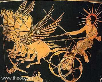
The Greece perceived the sun as the God whose name Helios. He was the brother of Eos (the dawn goddess) and Selena (the moon goddess). Helios causes the sun to rise by riding his golden, 4 horses chariot. The chariot has a fire tail which is the fire of the sun. In the illustration of the ancient Greeks, the sun god has a shining light around his head just like any other god. This time, the sun is like a fire.

Helios
http://www.theoi.com/image/img_helios.jpg
The sun in the illustration of the ancient Egyptian is very simply. It is a circle with many hands around. I think that the ancient Egyptian perceived the sun as strength and power, the Giver of life and goodness. The hands are the light of the sun. The sun light is turned into many hands. This gives the sun a different meaning.

http://www.bluedolphinpublishing.com/Egyptian/Aten.jpg
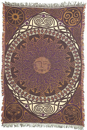
I found out that the most interesting images of the sun are from the Aztec and Celtic. The sun in these 2 countries has many details. People draw the sun in many different ways according to their imagination. The sun can be an eye that can see anything on Earth. The sun can also be a head of a man or a head of a lion. Especially, the Japanese’s sun god is female. . Amateras-Ohmikanmi is the female representation of the sun.

Celtic sun
http://www.nonduality.com/12742.jpg

Aztec sun
Subscribe to:
Comments (Atom)