Friday, March 30, 2007

Orchid Excercise


In this excercise, I choose the orchid that is thorny but beautiful. I chose A Yummy Apology font for the title to make the card looks elegant. I choose the green color for the title and dots in harmony with the flower. The dots are not only used to decorate the card but also used to attract the viewers to important information

Thursday, March 29, 2007

Flower soul

Flower soul is the exhibit of artist Bach Lan which is held in HCM from 15 - 30 March , 2007. Her works mostly derive from the harmony of the beauty between flowers and virgin. She mostly used mixed cool and warm color. The color combination give me a calm and deep feeling.

Here are some of her oil-paitings which I shot yesterday.


Monday, March 26, 2007

Playing with Type

I love to look at types visually. Every character is lively and it inspired me


Dancing girl

( font : Minion Pro , using Illustrator)


Cheep Cheep Cheep ...

(font : Bauhaus 93 , using Illustrator )


HAPPY FAMILY

(font : Bauhaus 93 , using Illustrator )

Friday, March 23, 2007

Poster Layouts

This is the original poster which I got from student work area in school. I don't like the layout so I try to create another.


Because the poster is printed in black and white so I just modified the texts to make the poster more interesting to viewers.
This is my first try :


And the second layout :


Tuesday, March 20, 2007

Perspective

Perspective can be a very useful tool in advertising

Here are the advertisement of a slim - fat milk :

With a different viewing angles:


Thursday, March 15, 2007

Gestalt Excercise

This is my excercise using Gestalt law. In this work, we try to demonstrate closure, proximity and continuance.
My first layout:


My second layout : Just explain to clarify my idea :
Being Inspired by the "S" Shape, I want to illustrate the "sex life". In my illustration, the "S" shape is a little sprout that start from the earth which is the block of text below. The sprout is the result of the "sex life" of plans.

Chip Kidd - Famous book cover Designer

I loved to read books not only when I was a little child but also when I grow up. I used to come to the book store just only to have a look at books. Book cover plays an important part when someone wandering in the book store to find an interesting books. One of the most famous book cover designers in America is Chip Kidd.
When I looking at some of the book cover that he designed, I found out that the cover doesn’t have too many details on. This is the ways Chip Kidd do with his work. His works also have images that related to the content of the book. Although Chip Kid said that “the content inside is more important than the image on the cover”, we all firstly judge a book by its cover. The book cover plays an important role in communication between a book and viewers. Art and commerce meet on the jacket of a book. We have to see and also to read whenever looking at the book cover made by Chip Kidd. The covers designed by Chip Kidd are also related to the title or the content of a book but the reader has to make a guess as to what the connection is. It likes closure, when we leave something blank so the viewer can actually participate in. Chip Kidd are successful in drawing people attention to the book.

Let's have a look at some of the book cover of Chip Kidd that I found interesting :


In this picture, Chip Kidd makes viewers surprise just by changing the viewing angle of the image. Commonly, we see many picture that show the images of superman looking from bottom up to top with so many respect.It is the super hero. But in this picture, superman appears to be unsual and strange. The viewing angle from top to bottom creates the shadow of his head and eyes let us see superman somewhat evil, unfaithful. Just by changing the viewing angle of the image, Chip Kidd attracts viewers and make the cover much more interesting
Another interesting book cover :

http://www.amazon.com/Blood-Moon-James-Ellroy/dp/140009528X


It looks like the character is real. Book in book. The arrangement of texts is simple and clear to draw the viewer's attention to the image.


www.flakmag.com/features/images/kiddjurassic.jpg


www.wklondon.typepad.com/.../images/surprise.jpg

After all, the book cover made by Chip Kidd is simple and clear. The most important of his work is the harmony of the images and text, connotation and denotation meaning of the image.

Friday, March 9, 2007

Figure and Ground

Figure/ ground is the term used to indicate the ability of human to diferrentiate elements according to their contrast. When we look at an image or picture, our visual system tends to simplify visual things into figures. Figure and ground cannot be seen at one time but we can see them sequentially.
Usually, figure occupies a smaller area than does ground.
Understanding how we see thing can be very useful especially in design. It is impossible to have figure without ground. The red circle we draw in white sheet of paper is figure. The white paper left alone is ground. However, the negative space also plays an important role because the white space gives our eyes the space to rest.
This is an example :


http://en.wikipedia.org/wiki/Image:Facevase.JPG


What do you see in this image , a vase or 2 face staring at each other? It depends on you. You can see a vase if you see the figure is in white and the ground is in black and vice versa, you can see 2 faces.

So, Figure and ground plays an important role in when we see picture. We can learn from the principle of figure and ground to make out piece much more interesting. The following is some interesting pictures that trick our eyes :


Thursday, March 8, 2007

Something about the Sun


There are painters who transform the sun to a yellow spot, but there are others who with the help of their art and their intelligence, transform a yellow spot into the sun.”
Pablo Picasso (1881-1973)
Throughout history, the sun is the symbol of power. Because the sun gives out light and energy, bring us the day, so the ancient people perceived the sun as the god who has eternal power. The sun appears in the history of many countries.
In Vietnam, the sun is transformed into “banh day” which is made from rice (rice cake). Banh day cake usually appeared in Tet holidays. Banh day is the symbol of the sky and the sun. Banh day has a round shape and its color is white. The sun is very important. It plays an important role in VietNam . It is quite simple and familiar.
Banh Day

http://www.nguoivienxu.vietnamnet.vn/dataimages/original/images765874_Banh-day.jpg

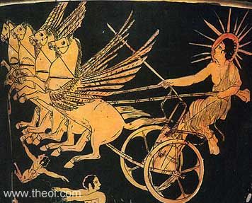
The Greece perceived the sun as the God whose name Helios. He was the brother of Eos (the dawn goddess) and Selena (the moon goddess). Helios causes the sun to rise by riding his golden, 4 horses chariot. The chariot has a fire tail which is the fire of the sun. In the illustration of the ancient Greeks, the sun god has a shining light around his head just like any other god. This time, the sun is like a fire.

Helios

http://www.theoi.com/image/img_helios.jpg


The sun in the illustration of the ancient Egyptian is very simply. It is a circle with many hands around. I think that the ancient Egyptian perceived the sun as strength and power, the Giver of life and goodness. The hands are the light of the sun. The sun light is turned into many hands. This gives the sun a different meaning.


http://www.bluedolphinpublishing.com/Egyptian/Aten.jpg


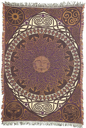
I found out that the most interesting images of the sun are from the Aztec and Celtic. The sun in these 2 countries has many details. People draw the sun in many different ways according to their imagination. The sun can be an eye that can see anything on Earth. The sun can also be a head of a man or a head of a lion. Especially, the Japanese’s sun god is female. . Amateras-Ohmikanmi is the female representation of the sun.

Celtic sun

http://www.nonduality.com/12742.jpg


Aztec sun

http://www.lythastudios.com/misc/jd/pics/jd42.jpg